01
Editorial hierarchy
Serif display at dramatic scale—typography functions as the primary visual element.
Monograph
Issue № 01
Editorial luxury without accent colors—only black, white, line weight, and typographic drama at architectural scale.
Metrics
99.9%
Uptime
4.8
Editorial score
21:1
Contrast ratio
0
Accent colors
01 — Capabilities
01
Serif display at dramatic scale—typography functions as the primary visual element.
02
Hairlines and heavy rules replace shadows and color accents entirely.
03
Hover flips black and white in 100ms—no gradients, no glow, no radius.
02 — Process
I
Strip accent colors and radius until only black, white, and type remain.
II
Lock Playfair display sizes—8xl and 9xl headlines on desktop, 5xl on mobile.
III
Apply horizontal lines, grid, diagonal, and noise so the surface is never flat.
IV
Stats bands, CTAs, and hover cards use inversion instead of accent hues.
03 — Rationale
True #000000 and #FFFFFF. Gray only for secondary text and hairlines.
Playfair headlines and Source Serif body—editorial, not startup sans.
0px radius everywhere. Depth from rules, scale, and negative space.

Imagery stays grayscale until journal hover—borders carry the structure, not shadows.
04 — Product detail
onograph strips design to essence. No gradients to soften edges, no accent hues to hide weak hierarchy—only serif rhythm, hairlines, thick rules, and inversion bands that command attention through restraint. The page breathes through dramatic negative space; black elements gain impact from what surrounds them.
05 — Voices
It reads like a fashion spread—not a SaaS template. Every rule feels intentional.
The inverted feature cards stopped our team mid-scroll. Black is the only accent needed.
Walking through the site feels like a gallery catalog. Stark, confident, timeless.
06 — Journal

APR 12 / TYPOGRAPHY
Why monochrome forces better hierarchy decisions than any accent swatch.
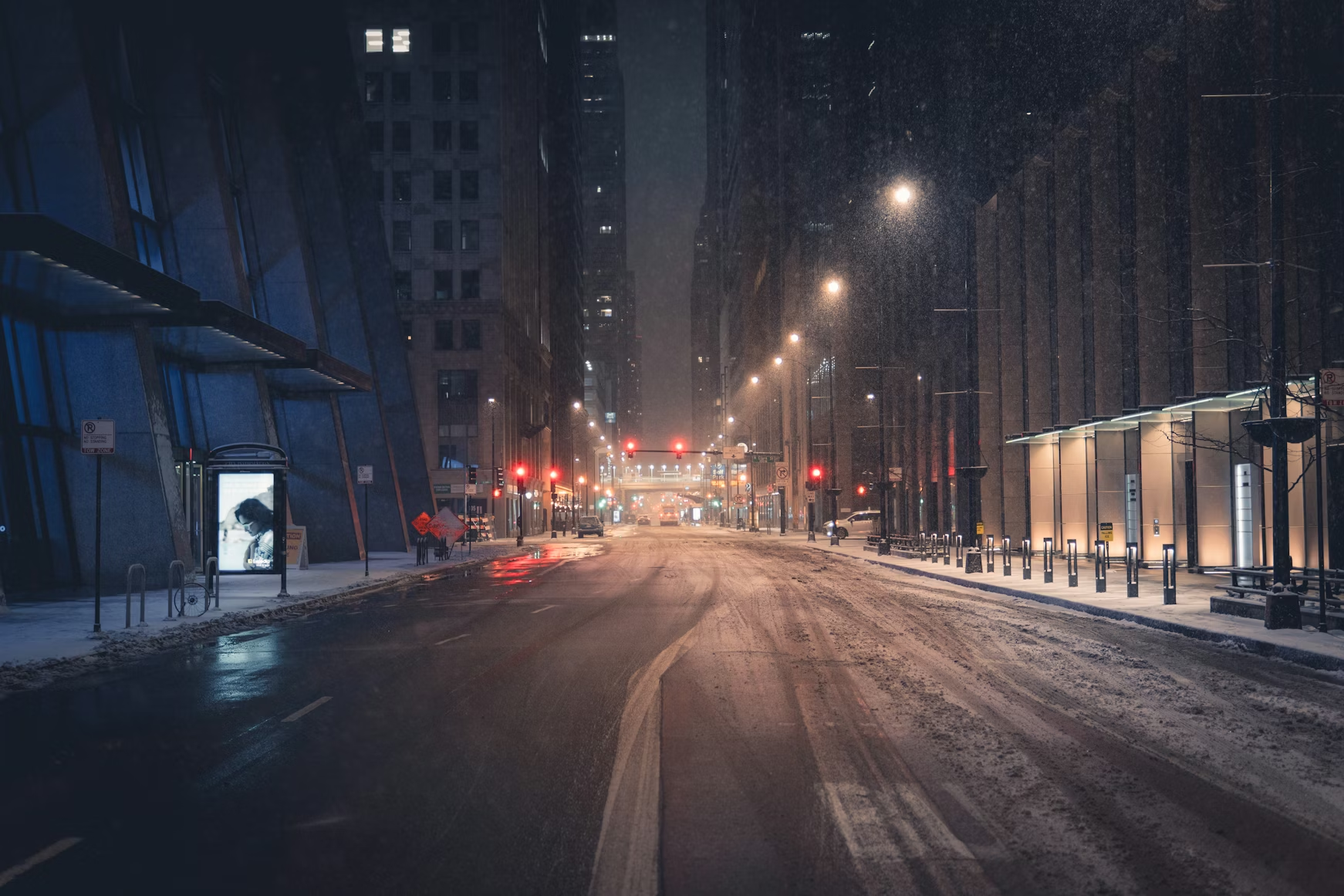
MAY 03 / SYSTEMS
Sharp geometry as architectural discipline across every component.
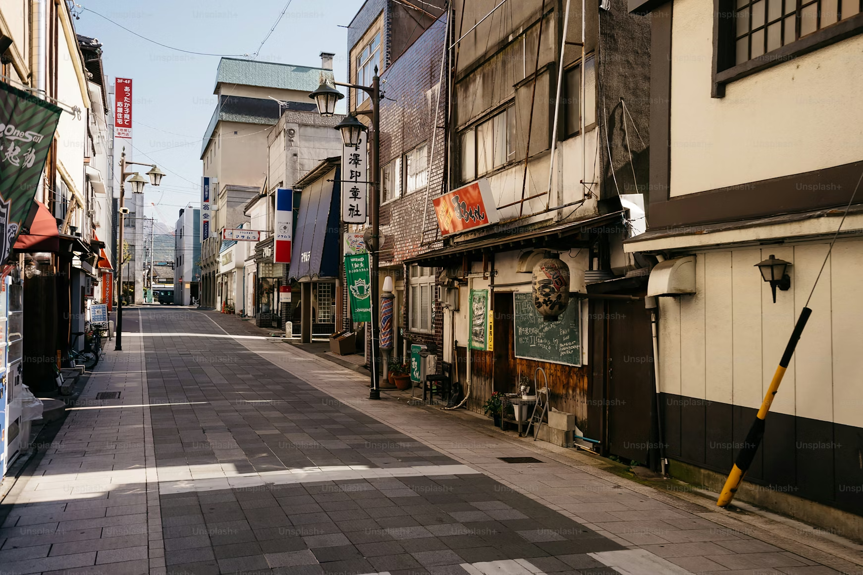
JUN 18 / LAYOUT
White line texture on black fields—depth without shadows.
07 — Plans
Essay
$29
Single editorial landing for focused launches.
Edition
$89
Full multi-section site with inversion modules.
Archive
Custom
Org-scale rollout with workshops and governance.
08 — FAQ
No. Black is the accent. White is the canvas. The palette is absolute.
Inverted CTA band with radial texture—black is the accent. Request your editorial edition.
Essays on typography, restraint, and monochrome systems.